Climate Clock
Global warming is projected to rocket past the 1.5 °C limit. To steer against it, action must be taken now by climate stakeholders, leaders, governments and communities.
That’s the aim of the Climate Clock movement—to remind these people of the urgency, of the time left. So they created the Climate Clock and subsequently the ‘Deadline’.
Climate Clock has typically done this with installations and physical clocks. We helped them take their concept to a completely new and fitting medium: the clock on your wrist.
Selecting the information
What information does the Climate Clock provide?
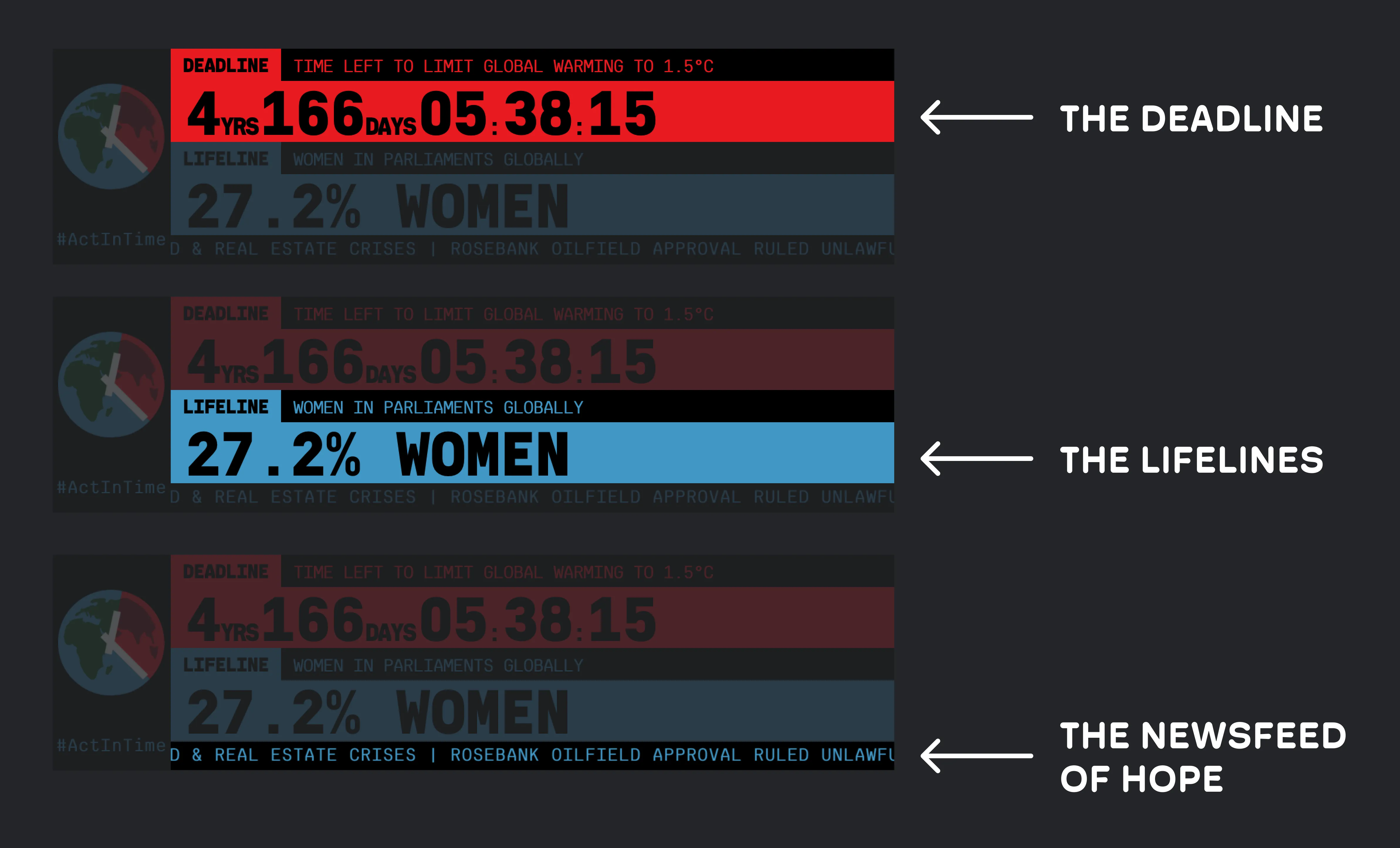
We didn’t simply copy and paste what was already there onto a different screen. Let’s take a look at how we analysed the information and divided it into three separate pages.
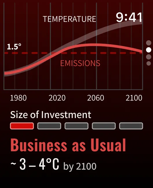
1. The Deadline
The meaning of a deadline or countdown is pretty straightforward, but this was probably the part of the app we spent most of our design time on.
In order to conserve battery life on the small device, Apple has put some restrictions on what apps, and more specifically widgets, can render. For example, widgets are only allowed to refresh content 40–70 times a day. As we need to update the widget every second, that’s 86,330 refreshes too few in the best-case-scenario.
What now?
We decided to split the renderer in two separate elements. The year and day, which only needs to update once a day, and the more granular countdown, which needs to update every second. For the countdown, we can use a timer Textstyle
Text(dailyTimer, style: .timer)
  .monospacedDigit()
which is text display property that renders a countdown.
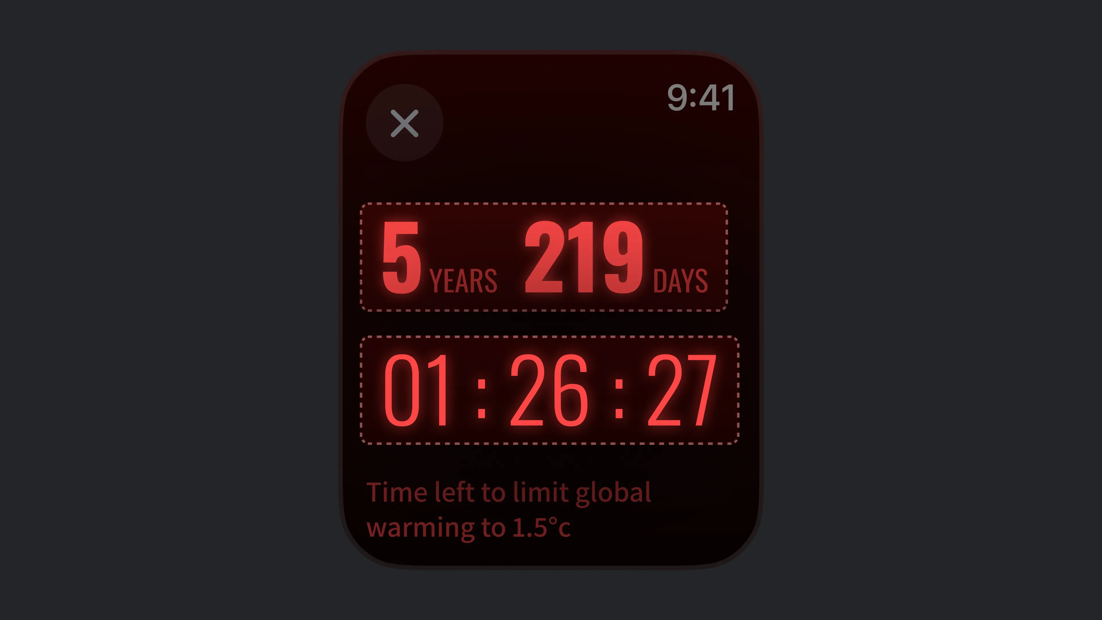


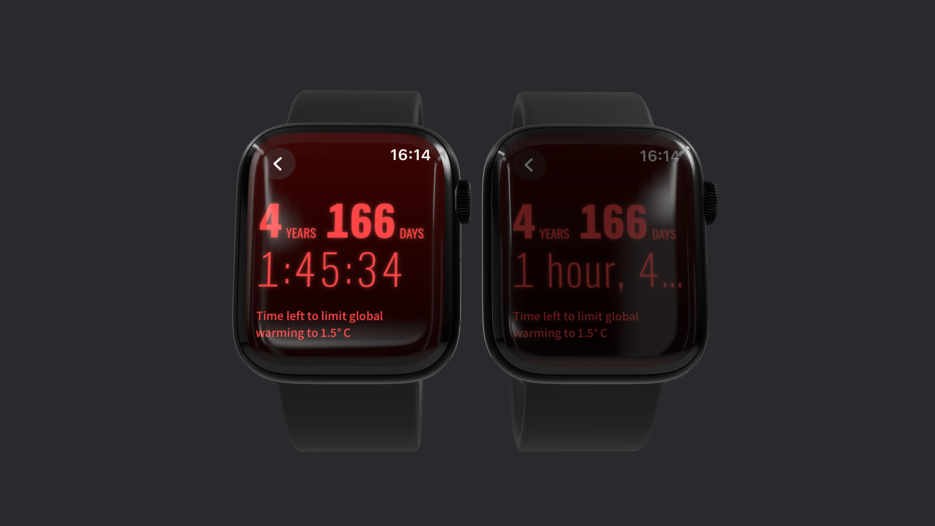
This has an additional benefit. When the device enters the always-on state, the timer automatically changes the type of time notation from seconds to minutes, so it doesn’t need to update every second—saving even more energy.
2. The Life Lines
On previous climate clocks, Lifelines are displayed one at a time. Since you can scroll on the Apple Watch using the touchscreen or the digital crown, we didn’t have the same space constraints that climate clock makers have on other form factors.
This allowed us to put each lifeline in a list. We also assigned each lifeline a distinct colour to ensure they were easily distinguishable. When combined, these lifeline colours create a subtle gradient.
Some of them also have a trick up their sleeves: they are animated. Since values like this can be easily interpolated while remaining fairly accurate, we animated the lifelines so that you can see the change in real time.
3. The Newsfeed
The Newsfeed is where we think we have most improved the status quo.
Staying up to date with what’s going on in the world can be crushing. In a bunch of aspects it even feels like we are moving backwards.
And of course that’s happening. But there are also good developments. Sadly, that often goes unnoticed.
This is why the Newsfeed of Hope is so valuable! Every day, users get a notification of a hopeful news article.
−
On their website, the headlines simply scrolled past, below the deadline and lifelines. The only way to actually consume the curated newsfeed was to subscribe to their newsletter, which sent you a list of articles each week.
We added a newsfeed view where users receive a hopeful and positive message every day. As we simply take the same list of articles and distribute them throughout the week, the Climate Clock team didn't even need to adjust their workflow.
We think this is the most useful feature we have added to the app. Seeing hopeful news on a regular basis goes a long way to reducing ‘eco-anxiety’ and restoring motivation.
Improving Climate-Communication
What’s the point of all this? What's the point of activism, of movements, of The Climate Clock?
We’d say: it’s to make people care. About each other and about the world.
One could do that by spreading ideas and stories or communicating science in an enticing way. And the Climate Clock Team does that remarkably well. They connect so many people, they have had so many great ideas and had real impact on real people.
That makes us even more proud that an idea we had seems to be so good, that their team wants to use it in their other communications—not just the Apple Watch App.
What idea are we talking about?
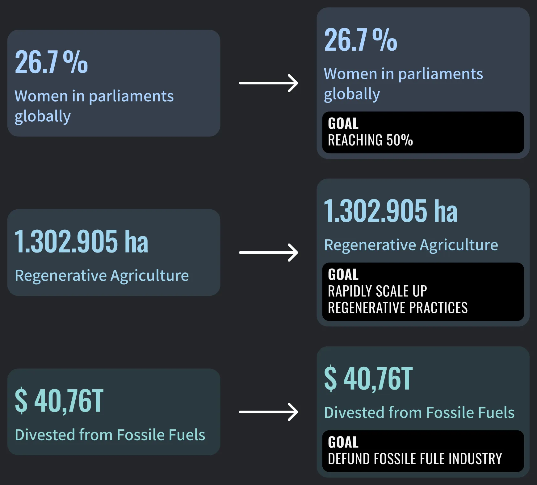
The Goals
As we iterated through some ideas on how best to visualise the lifelines, we found that some lifelines had very limited context, and just seeing the title made it unclear what it meant and where we needed to go.
So we added ‘goals’. Extremely simple concept, but adding goals to these numbers helps to add a huge amount of context.
For example: “1.302.905 ha Regenerative Agriculture” is relatively meaningless without anything else. With the additional goal of "rapidly scale up regenerative practices", we can see that the current area is much smaller than the Climate Clock demands. We also get a sense of urgency that this number needs to grow quickly. If the user checks back and the number hasn't increased by much, they know that current efforts are not enough.
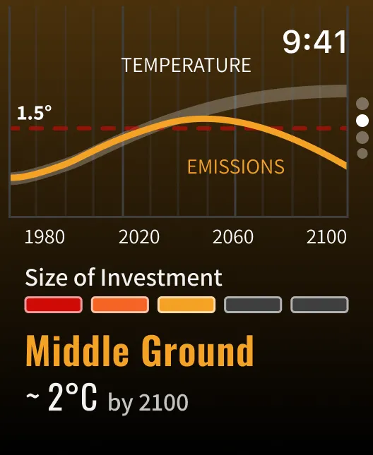
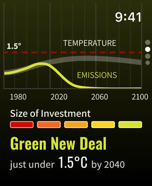
Climate-Scenarios and UX Concerns
One part we thoroughly investigated and iterated through were the Climate Scenarios.
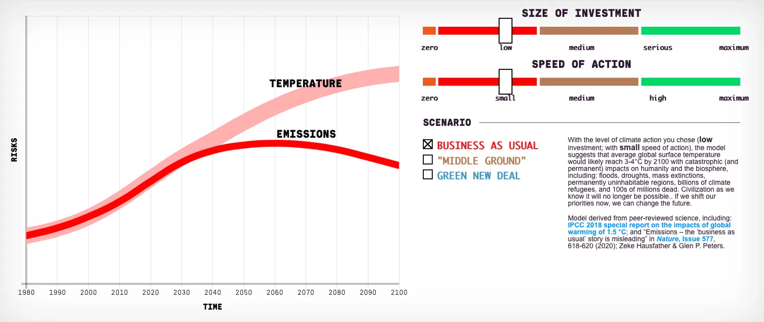
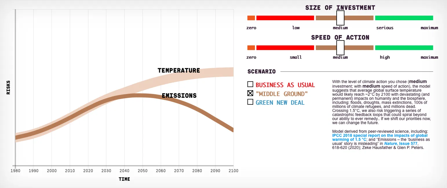
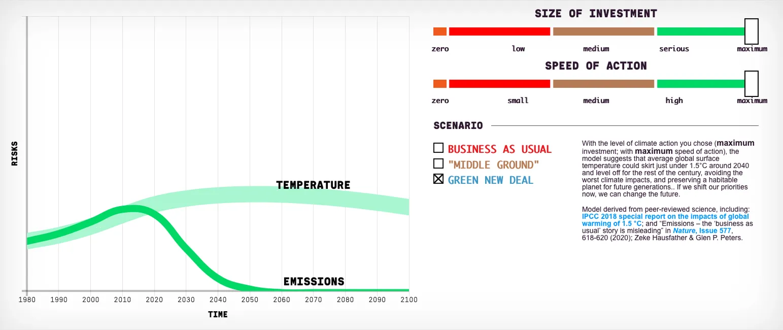


The scenarios represent a rough emission and temperature development depending on the two factors size of investment and speed of action.
We explored the possibility of also adding this to the app. We imagined, the interaction of changing parameters with the digital crown could provide satisfying and direct feedback of what matters in our fight for climate justice.
We unfortunately found out while user-testing a prototype, that the interaction can often be confusing—especially if the user hasn’t explored the scenarios on the website before.


Native SwiftUI
We believe that native software is always the way to go. Without getting too technical, if software is native, it will almost certainly outperform cross-platform/web applications in every metric relevant to users.
Performance is better, you are more tightly integrated with the operating system (this allows for the animated text styles mentioned in the Deadline chapter, for example), and the app bundle is smaller.
The Climate Clock Watch app, for example, is about 3 MB in size. Non-native apps are typically 4 times larger—empty. Poorly optimised non-native apps can also run into the hundreds.
The Candy
Candy can mean a lot of different things to us. In this project, it’s mostly the meticulously crafted user experience with a few satisfying micro-animations that also add context.
This, combined with the user’s already learned navigation patterns, allows them to navigate the app smoothly without even thinking about it—assuming they have used Apple Watch apps before.